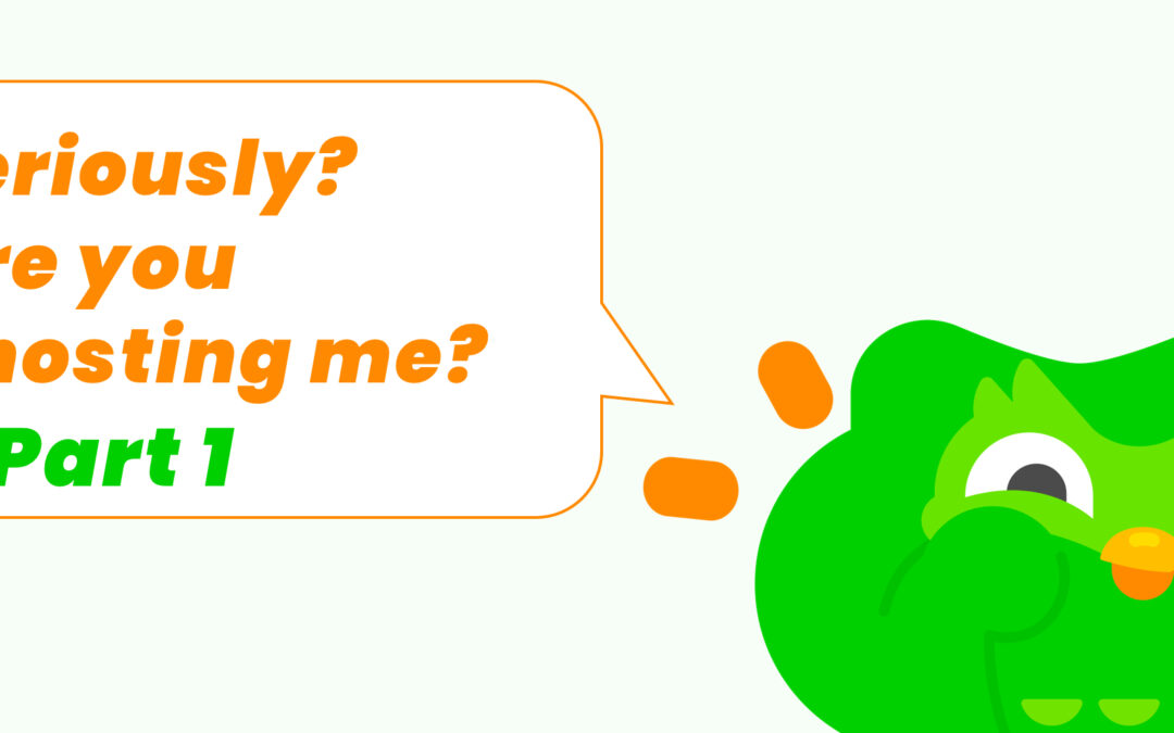
Why context changes everything for UX copy and how to find the right tone.
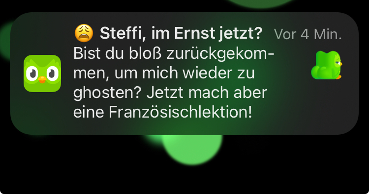
Quick recap from Part 1: We analysed why Duolingo's "Did you just come back to ghost me again?" notification works so well. Our conclusion: It plays with self-irony instead of guilt, a consistent product personality, honesty, and perfect timing. Check out part 1, "Seriously?" – Duolingo's UX Writing | Part 1: The Anatomy of a Working Notification here.
Why the same tone can motivate and manipulate - depending on context
Here we’ll answer the crucial question: Why does this tone work with Duolingo, but would be toxic with Instagram or TikTok?
Duolingo is a learning tool
- It's about an intrinsic goal: an example of a "pleasurable troublemaker" according to Prof. Matthias Laschke, a small, benevolent disruption that specifically encourages me to stick with it and control my own behaviour reflectively (cf. also Deci & Ryan, 1985)
- Adds value: The app helps me with my personal goals
- Alignment with user goal: The app wants the same thing I do - progress
- Finitude: There is a goal, instead of endless engagement
For comparison: Social Media is an Attention Trap
- Extrinsic goal: The app wants my time, I want, e.g. distraction
- Questionable value: More scrolling ≠ more quality of life
- Misalignment: The app wants my attention to sell it
- Endlessness: There's never enough, never a "finished"
The ethical boundary lies in purpose. : the same UX techniques can be motivating or manipulative – depending on whether they help me achieve my goals or distract me from them. (Cialdini, 2008; Fogg, 2003). Self-Determination Theory, as proposed by Deci and Ryan (1985), provides a crucial psychological foundation. It emphasises that people are particularly motivated and satisfied when their needs for autonomy, competence, and social connectedness are met. This is why honest and transparent design aimed at user well-being is both ethical and effective.
For Practice: A Framework for Ethical Engagement
We have developed a simple and practical question test to check whether an engagement strategy is ethically justifiable:
The 3-Question Method:
- Does it help the user achieve their own goal?
- Yes - with Duolingo (learning a language)
- No - with endless social media doomscrolling
- Would it still work if we transparently communicate what we're doing?
- Yes: "We're reminding you because regular practice helps with learning"
- No: "We're showing you emotional content so you stay longer"
- Would we want our own children/partners/friends to be addressed this way?
If you can answer all three with "yes," you're probably on the right side.
These three questions are not random, but are based on established frameworks from UX Ethics, such as Sharon Lindberg's Design Ethics at Work (research project on ethical considerations in design) and Ethical Persuasion models (e.g., the TARES Test by Baker & Martinson, 2001, as a conceptual construct showing how to evaluate transparency and user well-being in Persuasive UX).
Our goal was to translate these theoretical principles into practical question logic that product teams can apply directly.
What Designers and Developers can learn from this
1. Tonality is strategic, not decorative
Many teams treat UX writing as an afterthought: "Quickly write a text for the button." But tonality is part of the user experience – sometimes even the crucial part.
When implemented, this means:
- Define your product's personality before you write the first text
- Create a tone-of-voice guide with concrete dos and don'ts
- Test different tones with real users – what is perceived as funny by the team can be annoying for outsiders
2. Know your Product's Context
The tone works with Duolingo. Would it work with a banking app? Disaster! With a meditation app? Completely misses the mark!
Ask yourself:
- What is the user's emotional state in this moment?
- What is the overarching goal of my product and my users?
- What type of relationship should my product have with users?
3. Honesty > Tricks
Users aren't stupid. They notice when you're trying to manipulate them. Duolingo's directness works precisely because it's not disguised..
Here are some alternatives to deceptive patterns:
- Instead of "Only 3 left in stock!" → "Others are also looking at this right now"
- Instead of "Your friends miss you!" → "You have 3 new messages"
- Instead of "Last chance!" → "The offer expires on dd/mm/yy"
4. Humanisation requires Consistency
One funny notification is nice. A consistent personality across all touchpoints is an example of good UX Design.
A checklist for your product:
- Does your app sound the same in onboarding, notifications, and error messages?
- Would users recognise your product's "voice"?
- Does the tonality fit your brand – or does it feel forced?
- What role should your product take on?
Practical Tips: How to develop the right Tone
Step 1: User Research with Focus on Language
Understand how your users think and talk:
- How do your users talk about your product?
- What metaphors do they use?
- What relationship do your users want with the product?
Step 2: Define your Product Personality
Imagine your product as a person:
- What job would they have?
- How would they talk in real life?
- What would they NEVER say?
Step 3: Test in extreme Situations
A good tone shows itself in crises:
- How does your app talk when something goes wrong?
- How does it communicate errors?
- How are users addressed who have been away for a while?
Step 4: Iterate with real Feedback
User exposure will change your tonality. Test, learn from it, and adjust accordingly.
What Duolingo also teaches us: The Power of Microcopy
This notification we are discussing is about 15 words long. But it shows what microcopy can do when it's done well:
- Re-engagement without pressure
- Brand building through consistency
- Emotional connection through humour
- Behaviour change through the right tone
The best UX texts are the ones you show your friends and say, "Look how funny this is!"
Conclusion: UX Writing is UX Design
Duolingo's owl is not a marketing gimmick. It's a carefully developed personality that has a positive effect on the user experience. Every notification, every button text, every error message was designed so that it:
- Fits the Duolingo brand
- Understands their users
- Communicates honestly
- Motivates action – but without manipulating
This is not a coincidence, but a strategy.
And in the end, good UX writing is like good UX overall: invisible when it works and unforgettable when it has an impact.
This is part 2 of the two-part series on UX Writing and Design Ethics. 👉 Part 1 can be read here: The Anatomy of a Perfect Notification
At BIRD UX, we have been developing the strategic foundation for such nuances since 2011: We help our clients develop consistent UX strategies in which content and text are not added as an afterthought, but are considered from the beginning as a fundamental component of the user interface. Tonality is not a question of copywriting – but of product strategy. Sounds like we can help you with your challenges? Feel free to get in touch!
Literature
- Baker, S., & Martinson, D. L. (2001). The TARES Test: Five Principles for Ethical Persuasion. Journal of Mass Media Ethics, 16(2–3), 148–175. https://doi.org/10.1080/08900523.2001.9679610
- Cialdini, R. B. (2008). Influence (5. Aufl.). Pearson
- Deci, E. L., & Ryan, R. M. (1985). Intrinsic motivation and self-determination in human behavior. New York, NY: Plenum
- Fogg, B. J. (2003). Persuasive technology: using computers to change what we think and do. Morgan Kaufmann Publishers
- Hassenzahl, M., & Laschke, M. (2015). Pleasurable Troublemakers. In S. P. Walz & S. Deterding (Eds.), The Gameful World (pp. 167–196). The MIT Press. https://doi.org/10.7551/mitpress/9788.003.0011
- Lindberg, S. (2024). Design Ethics at Work. https://urn.kb.se/resolve?urn=urn:nbn:se:su:diva-233188
Article Image Character from https://duolingopress.lingoapp.com/