Kreuzberg Initiative Against Anti-Semitism (KIgA)

UX design and content strategy for an educational platform
The education platform "Anders Denken" provides educational materials for teachers, educators, civil society actors, and interested parties. We supported KIgA's project with Content Strategy and UX Design.
We supported "Kreuzberger Initiative gegen Antisemitismus" (KIgA) with the initial concept of a political education platform against Anti-Semitism. The platform aims to promote a pedagogical engagement with current forms of Anti-Semitism built on three pillars: background information, educational materials, and contributions to current events. and Contributions to current events include.
The platform aims to inform multipliers in the education sector throughout Germany. This includes teachers, social workers, education consultants, etc. An additional goal was to integrate a nationwide expert database.
Since this was a completely new service without existing content but with many ideas, we began with a needs analysis. We developed an initial concept based on the results of this audit in collaboration with KIgA. This concept included an initial proposal for a content strategy, the basis for the detailed concept, in which we specified page types and functions.
The project was introduced to the public on June 20, 2018, at the State Centre for Political Education in Berlin.

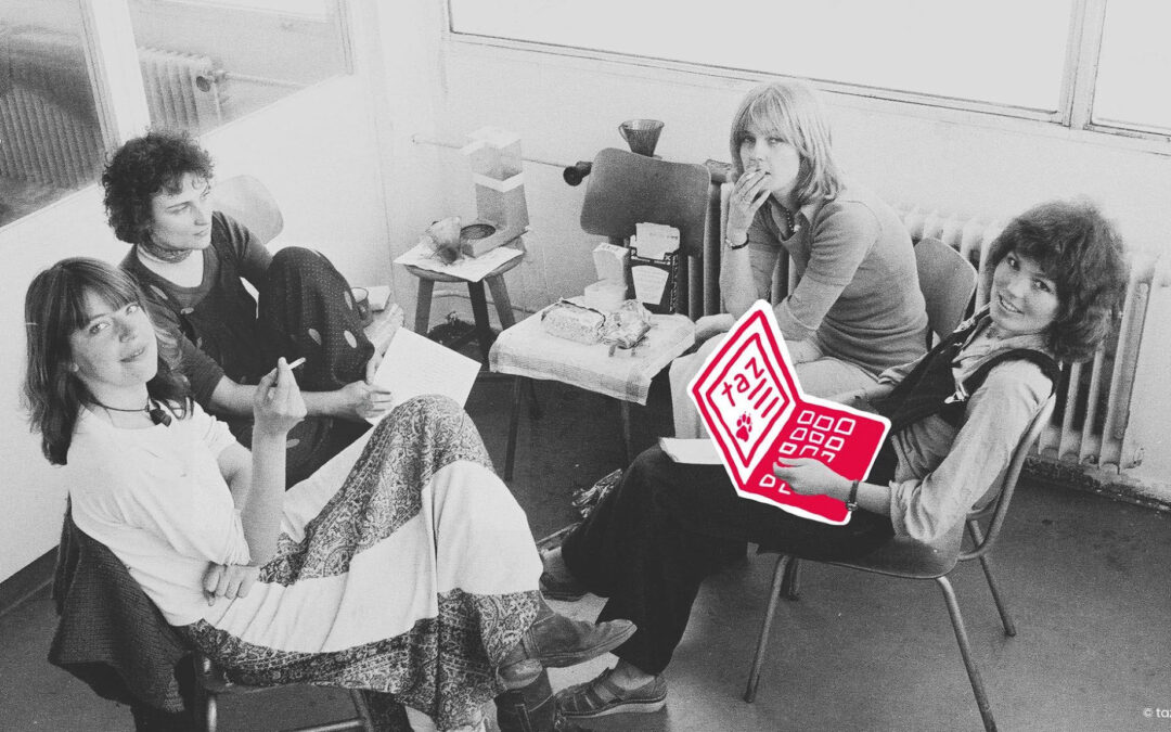
Panel discussion as part of the presentation of the online platform "Anders Denken" at the State Centre for Political Education in Berlin
Building the initial concept for the educational platform
Needs Analysis
If a project team works towards a shared vision, a project is potentially more successful. Everyone needs to be on the same page concerning project goals. Not an easy task to achieve when, as in our case, there was not even platform content available. We had to start with a rough concept, which would slowly bring us closer to our final solutions.
Our process:

A target group analysis provided a first insight into the needs of the intended users. Stakeholder workshops helped us define further requirements. Findings from both methods helped us develop the conceptual foundation for the new educational platform.
In the first strategy workshop with the team, we established a shared vision by discussing and answering questions such as:
- "What is our vision? What will the service achieve in the future? (Future Lab)
- Why is the platform relevant?
- What do we do better than previous or alternative solutions? (Value Proposition)

Impressions from the strategy workshop at KIgA. Here: The Future Lab - Where Do We Want to Go?
Prioritisation and Re-briefing
We consolidated the results of our target group analysis and Shared Vision workshop in a second, focus-oriented workshop in which we prioritised the desired requirements using a cost/benefit matrix. This approach enabled us to collectively agree on a list of requirements for an initial release.
We incorporated the workshop outcomes into a re-briefing document and distributed it to all team members. A re-briefing abstract that all team members can agree upon helps ensure everyone has the same ideas and goals in mind - before the conceptual work begins.

Example of initial design principles (inform strategy): What should the desired user experience feel like?
Providing a compass with Design Principles
The workshop results and target group analysis helped us derive Design Principles , a strategic tool which can serve as a decision-making aid for the entire project.
Design Principles provide a compass for product development as they visualise the desired user experience, which should ease decisions. Although we defined a long-term vision, there are stumbling blocks along the way, and strategic guidelines (Design Principles) help us "stay on track." They help us evaluate decisions by answering whether they align with or contradict our principles.

Rough conception of the content structure. From the idea on the whiteboard (left) to the rough concept (right)
Concept and Design
A Content Strategy as a guiding principle for further conception
The re-briefing draft and the Design Principles were the basis and guidelines for our rough concept, the content strategy..
In this context, we developed the idea of the three main Calls To Action, which should reflect the three main pillars of the project:
- Inform (containing background information))
- Orientation (containing contributions on current events))
- Act (containing educational materials).
The content strategy served as the basis for the detailed concept, in which page types with functions were specified, informing the technical implementation.

The homepage with the three prominent colour-coded quick links supports, among other things, targeted searching. Concept sketch (left) and visual implementation (right).
Concept for two Search Modes
An important goal we had was easy content findability for everyone. We took two search modes of potential users into account when designing navigation solutions:
- Targeted Search ("I know what I'm looking for and how to phrase it.")
- Exploratory Search ("I know roughly what I'm looking for, but I cannot phrase it.")
#1 Design Solutions for Targeted Search
During Targeted Searches, users usually already know what they are looking for and are aware of the words to use when searching. Our solution for this type of search was descriptive and understandable menu labels. In addition, we brought the three main content pillars (Inform, Orient, Act) into focus with prominent, colour-coded quick links to improve orientation.
Additionally, we designed a search concept with auto-suggest functionality enriched with metadata (i.e. tagging) and a clearly arranged listing of search results. These solutions helped visitors searching for content in a targeted manner reach the result quickly due to efficient user guidance.
#2 Design Solutions for Exploratory Search
During Exploratory Searches, visitors usually have a rough idea of the information sought but do not necessarily know how to phrase it. "I know it when I see it" often applies - meaning recognition plays a crucial role. However, even when relevant content is recognised, the user might still ask themselves whether all relevant information was foundn or if there is more.
We used clear and descriptive labelling of navigation elements and content tagging to serve this information search type. Contextualised presentation of related content through tagging is essential when learning more about a topic and can help increase knowledge.
We assumed that this type of search would be relevant when searching for educational materials. As a result, we designed a filter that considers attributes such as "topic" (of the material), "age" (of the students), and "duration" (of the class) to help narrow down and find relevant educational materials and methods.

Filter concept of the educational methods with the attributes: topic, age (of the students) and duration of the teaching unit.
What our client has to say:
With the online platform, we wanted to achieve and enable quite a lot of things at the same time, while time and budget were rather tight. Jenny and Steffi from BIRD UX navigated us safely and supportively through the conception phase. Their know-how, creativity, professionalism and commitment were decisive for the very success of the website and the great success of the platform that continues to this day.
The Challenges
The challenge of this project was working with limited resources , which might limit solutions. The limitations, however, were also the exciting part. How can we approach our ideal vision despite our limited editorial and time resources?
At the time we created the initial concept, no content was available. Therefore, we developed the information architecture and content strategy based on a small survey and our best assumptions , which served as a starting point for discussion. Ultimately, we gradually approached working solutions together with the team.
Most fun
Great teamwork is simply fun. Above all, the many possibilities and the enthusiasm that arise when you start from scratch allow creative thinking and ideas to bubble up.
This project has once again shown the positive effects of close collaboration with the client and, above all, how important it is that the project team agrees on visions and goals - and that we as designers do not simply deliver a solution according to the briefing.