taz Publishing House

Design Principles and Customer Focus as the Driving Force for “Seitenwende”*
How can a national daily newspaper without a paywall remain future-proof during a media crisis?
The renowned taz publishing house faced this very question in 2018 and developed a plan to publish the weekday edition of taz exclusively in digital form. Several years have passed since then, as such a step requires careful planning, consideration, design, and communication. For a publishing house to be future-ready, everyone involved must be able to visualise this future and stand behind it.
One of the first questions we therefore wanted to answer together with taz was: What is the vision for the taz of the future?
Breaking Down Silos and Building a Vision
The taz Publishing House is a complex ecosystem that encompasses far more than just subscriptions and advertising. Its sphere of influence ranges from travel and various event offerings to diverse support formats (e.g., Panther Foundation, International Research Fund), as well as cooperative and customer service, each organised within its own department. Naturally, each department has unique wishes, ideas, needs, and requirements for the transformation process. We had to balance this diversity and ensure everyone is pulling together and shares the same vision and goals.
Following initial workshops and usability tests, we developed a concept and design system for taz publishing in collaboration with the in-house project team and art directors Janine Sack and Christian Küpker. The design system later served as a foundation for the relaunch of the taz editorial pages.
The Challenges
Digital collaboration during the pandemic: The project’s kick-off phase coincided with the outbreak of COVID-19. All research and workshop activities had to be moved online at short notice. Despite this, stakeholder interviews, usability tests, and co-creation sessions were all successfully carried out digitally.
A wide range of ideas and requirements: All publishing units and the editorial team had to be aligned to a common vision. Differing expectations, content, and structures needed to be consolidated into a user-centred concept.
Focus on future viability: Key business processes such as “taz zahl ich” (voluntary payment) and subscription workflows needed to be streamlined and optimised.
Scalability: In addition to the publishing pages, the editorial team was also to be included at a later stage. The aim was a design system that works across the board and sets consistent standards.

The design principles of taz: “inclusive, solidary, iconic” – illustrated through powerful symbols of community. Symbol design ©Janine Sack and Christian Küpker.
Our Solution: Process & Key Features
The Foundation: Transparency through consolidated UX Research and Co-Creation
In-depth, semi-structured stakeholder interviews revealed the needs and pain points across all departments, creating transparency around requirements for all involved. Vision workshops with various taz teams helped sharpen strategic direction and gather further insights, while moderated usability testing provided valuable perspectives on user needs and expectations. The result was a shared understanding of goals, design principles, and requirements – the basis for all further decisions.
Results:
- Problem definition
- Requirements Analysis
- Vision definition, including design principles

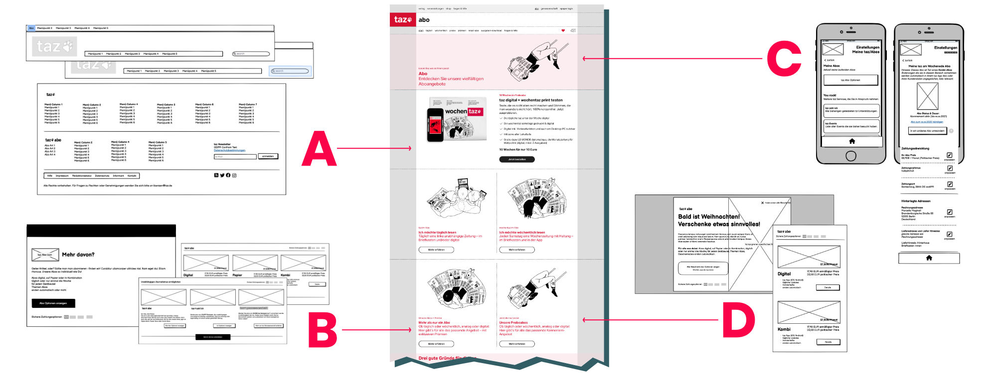
All roads lead to Rome. Possible entry points into the subscription purchasing process include global navigation elements (A), various teaser components (B), the taz app (C), and marketing components (D).
Taking Shape: Creating User-centred Structure
To make the publisher’s complex content understandable and accessible, we analysed and restructured existing content types across all departments through further workshops with the publishing house and editorial teams. analysed and restructured. With the help of Tree Tests and Card Sortings , we identified how users actually navigate and which orientation patterns make sense to them. From this, we developed a Hub concept, that bundled content thematically. This helped to align navigation fundamentally with the questions and needs of visitors, rather than internal perspectives. In addition, we created interaction designs based on wireframes for prioritised business areas, laying the groundwork for the design system.
Results:
- Clear information architecture for publishing and editorial teams, and improved user guidance
- Future-proof concept aligned to real user needs

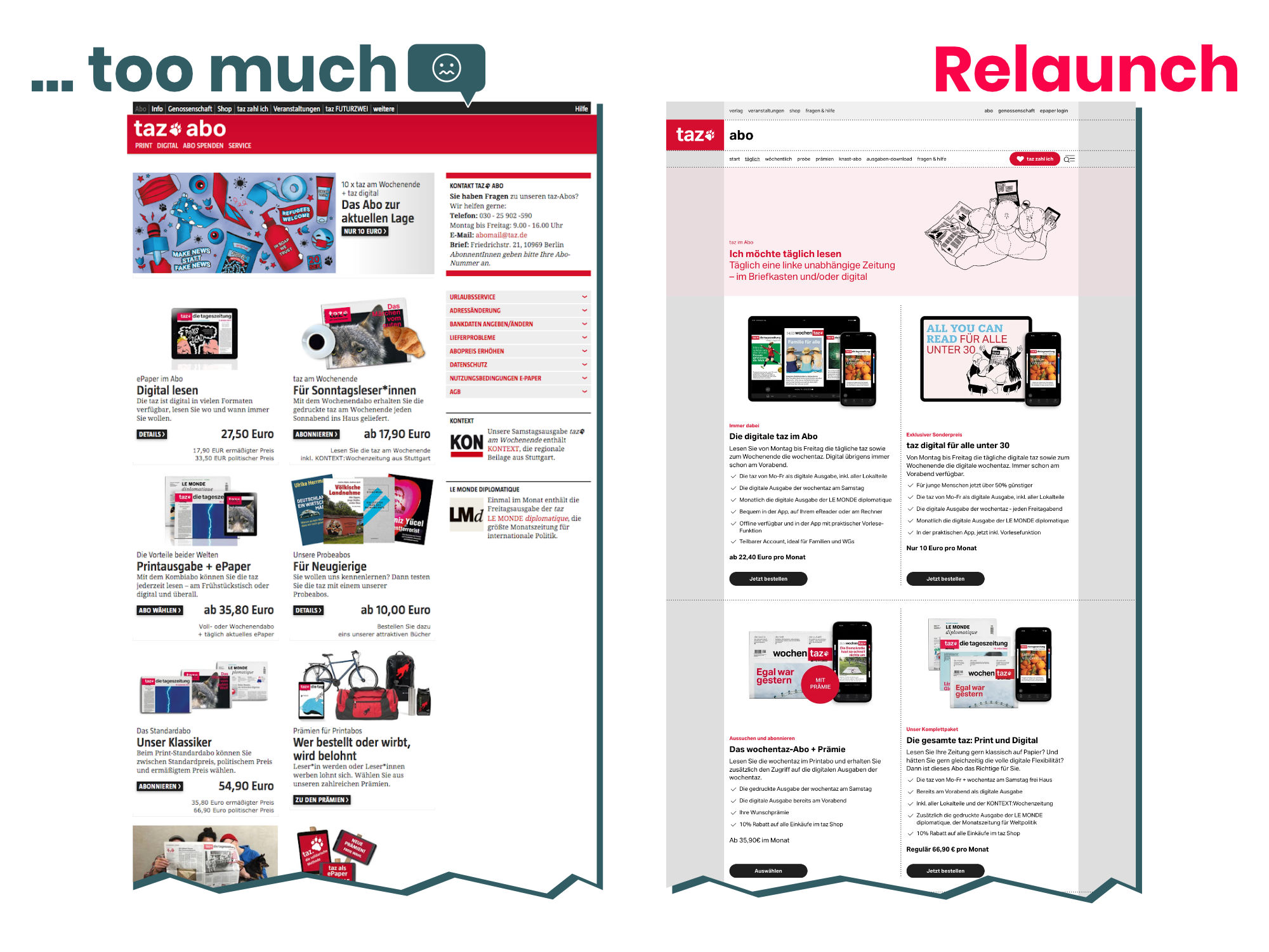
The result of the usability test was clear: the taz subscription overview page was "too much". Too many offers with too much information that was not comparable with each other. People were overwhelmed. Our solution: clear imagery, clear words in a structured form and optimised UX copy for a clear subscription offer.
Refinement with Impact: Coherence and Economic Sustainability Through a Design System
In parallel with the conceptual work, we worked with art directors Janine Sack and Christian Küpker to develop a comprehensive Design System. This was designed not only for the publishing pages but also with the editorial pages in mind, as well as the taz app, to ensure a consistent user experience. The system combines functionality with aesthetics, providing a scalable foundation that enables rapid adaptation and the efficient, economical creation of new page types. At the same time, it strengthens the visual identity of the taz brand and ensures that the house’s diverse products have a unified appearance.
Results:
- Design system with scalability across publishing and other products such as editorial and app
- Efficiency and economic sustainability in design and development processes
Looking to the Future with Confidence
The relaunch of the publishing pages in September 2023 marked an important milestone for taz. The foundation for the so-called “Seitenwende” (turning point) was laid.
The new publishing page offers:
- Clear, user-centred navigation that speaks the users’ language
- A coherent experience and visual design that reinforces brand identity
- A digital platform that makes the diversity within the taz publishing house visible and tangible
At the same time, the taz app was continuously developed – with the same focus on user-friendliness and reading enjoyment.
With the digital relaunch, taz publishing has laid the groundwork to actively transform the media landscape. The close collaboration over three years has shown how UX Research, Co-Creation, and interaction design come together to develop sustainable digital solutions.
The Future Is Now
From 17 October 2025, die tageszeitung will appear exclusively in digital form on weekdays.
Nearly two years after the launch of the publishing pages and following the successful roll-out of the editorial pages, this historic step will mark the full realisation of the Seitenwende. taz remains a daily newspaper – just no longer on paper. The wochentaz will continue in print.
We are proud to have been part of this transformation process and look forward to the readers’ reactions and the next steps in this new era for taz.
*More about taz Seitenwende (German only): www.taz.de
Title image: ©taz publishing house


