This article appears in a similar form as Issue 19 of the LOVE /: RAGE LinkedIn Newsletter — the German-language newsletter about how we move digital experiences from RAGE to LOVE.
This is the third instalment of our article series on the dimensions of our CARE Check (Cognitive, Accessible, Responsible, Ethical). The previous issue focused on accessible websites , and the first covered Cognitive Load. Today, we turn to the Responsible dimension — and the design decisions that, in the worst case, cause users to turn away from you for good.
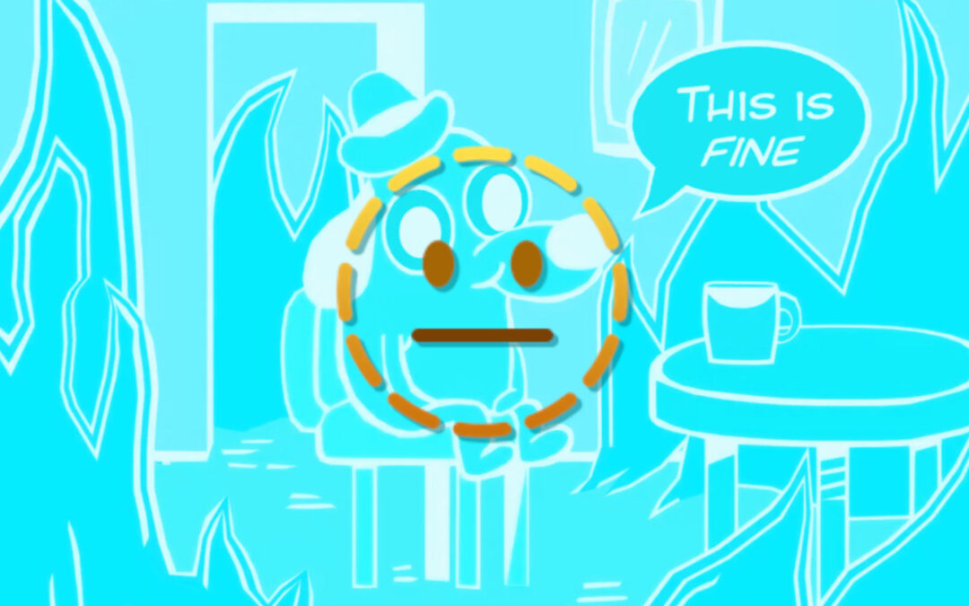
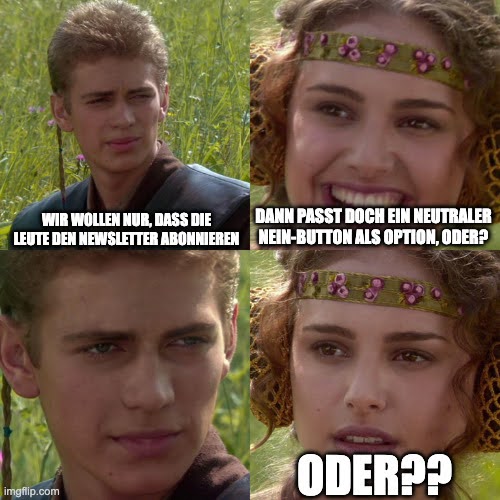
🤡 "No thanks, I'd rather stay uninformed."
Sound familiar? You want to unsubscribe from a newsletter or close a pop-up — and instead of a simple "No thanks", you're faced with: "No, I'd rather miss out on valuable tips." Or, a notch more shameless: "No thanks, I'd prefer to stay in the dark."
For a brief moment, you hesitate. Not because you actually want to subscribe. But because the phrasing plants a small seed of guilt. Then you somehow click "Yes" — or you close the window, annoyed, with a faintly bitter aftertaste. Either way, the whole interaction feels somehow… wrong.
That's Confirmshaming — and it's one of the most well-known examples of dark patterns: interface decisions that don't inform or support users, but push them in a particular direction. Not through persuasion. Through pressure, shame, or confusion.
What Are Dark Patterns — and What Drives Them?
The term dark patterns was coined in 2010 by UX researcher Harry Brignull. The community now increasingly speaks of deceptive patterns — partly because the name more precisely describes what's at stake: interface decisions that deceive.
What makes them insidious: very few dark patterns arise from genuine malicious intent. Most emerge because someone wanted to boost the conversion rate. Because a button came pre-built into a template. Because no one stopped to ask how this actually feels on the other side of the screen. That's the core problem with irresponsible design: it doesn't emerge in exceptional cases — it emerges in everyday work, whenever no one pauses to ask: Does this actually serve the people we're meant to support?
Responsible Design is the alternative. It doesn't mean giving up every conversion or abandoning marketing goals. It means making interface decisions consciously — with an awareness of the influence they have on your users' experiences and choices.
Four Dark Patterns You Should Know
Confirmshaming
As described above: the decline button is phrased to feel uncomfortable. "No thanks, success doesn't interest me" instead of "No thanks." The effect is measurable in the short term — but it leaves a lasting impression. And that impression is rarely positive.
Trick Questions
Wording in checkboxes or forms that means the opposite of what users assume when skimming. A classic: a pre-ticked box with the text "I do not wish to receive marketing emails" — anyone who doesn't read carefully and leaves the box ticked has just consented. The devil is in the negation. Users make mistakes they don't notice — until the first newsletter arrives.
Misdirection
Distraction through design: a prominent button leads to a particular decision, while the alternative — though technically present — is made visually almost invisible. Small text, greyed out, hidden away — in an accordion, for instance. The choice exists. But it's been designed so that no one makes it. That isn't neutral design. That's a guided decision.
Forced Continuity
A subscription starts free — and automatically renews as a paid plan, without a clear reminder and without a simple cancellation path. Users only notice after they've been charged. Heavily regulated in B2C contexts by now, yet still widespread — including in SaaS products and digital services.
The Legal Position on Dark Patterns: Not Just an Ethical Problem
Dark patterns have become a real problem for many organisations — and not only for moral reasons.
The Digital Services Act (DSA) has explicitly prohibited certain manipulative patterns for larger platforms since 2024: interfaces that deceive or pressure users violate Article 25 of the DSA. And what applies today only to "Very Large Online Platforms" could set the course for the entire digital market.
Several additional regulatory frameworks are also relevant:
The GDPR has required since 2018 that consent must be freely given, informed, and unambiguous. Pre-checked boxes for tracking or marketing are therefore not permitted in the EU — which directly affects many forms of trick questions. Anyone building cookie consent banners where "Accept all" is prominent and "Decline" is three clicks away risks not only a damaged reputation but GDPR violations.
The UWG (German Act against Unfair Competition) protects against misleading and aggressive commercial practices — including in the digital space. Confirmshaming that creates psychological pressure can be classified as an aggressive practice.
At EU level, the UCPD (Unfair Commercial Practices Directive) establishes that practices which materially distort the economic behaviour of consumers are unfair — regardless of whether they were deployed intentionally.
The trend is clearly moving towards ever-stricter legal requirements around manipulative patterns. This is also evidenced by the planned Digital Fairness Act (DFA), which would significantly expand protection against these patterns and apply to more than just large platforms. In Germany, the Federal Association of Consumer Organisations (Verbraucherzentrale Bundesverband) is also calling for, among other things, clear bans on manipulative patterns for all online interfaces.
In short: "We never built it this way intentionally" is no longer a defence. The question is no longer just whether your dark patterns are unethical. The question is whether they are — and will remain — legally sound.
Dark Patterns and Trust: The Fragile Emotion
There's no shortage of wisdom about trust. You may have heard it said that trust takes years to build and can be destroyed in seconds.
Anyone who pressures or misleads people — even unintentionally — therefore risks more than a warning. Someone who once feels manipulated doesn't come back. And if they tell a colleague, they might take that colleague with them.
Even if dark patterns can generate conversions in the short term, they erode precisely the relationship on which conversions depend. Declining trust can cause not just higher bounce rates, but also more support requests from confused users — and, where compliance is lacking, potential legal consequences.
Reputational damage is not an abstract risk. That's why the first step is simply to look. Many of these problematic patterns have grown historically — inherited from templates, built in by agencies, never consciously questioned. That doesn't change their impact. But it does mean no one needs to be blamed — only a process needs to be put in place.
Ask Yourself: "Would I Want to Defend This Flow?"
Before you make your next design decision — or before you audit existing flows — there's one simple question that works as a dark pattern filter:
Would I want to defend this flow to a user if they asked me directly why it was built this way? If your honest answer involves hesitation: 🚩 listen to your instinct 🚩🚩🚩. For auditing your existing pages and processes, these questions are also useful:
- Is the opt-out path as easy as the opt-in path? If "No" takes three clicks and "Yes" takes one, that's not neutral design.
- Are checkboxes and copy unambiguous — even when read quickly? Test with people who are seeing the text for the first time.
- Is there anything you've hidden — not for design reasons, but because it reduces conversion? Costs, cancellation periods, data sharing.
- Does anything on your page create a sense of urgency or pressure that doesn't reflect reality? Fake countdown timers, invented scarcity.
- Would your onboarding or checkout flow hold up to critical press coverage? If you hesitate — review it again.
Your Digital Product Is Misleading People — What Now?
Now that you're alert to the issue, you can review your pages and processes with fresh eyes. Use the questions above as a starting point. Go through your most important flows — donation processes, newsletter sign-ups, registrations, checkout — and ask at each interaction: Does this serve the user, or does it serve the metric?
This isn't a one-off exercise. Responsible design is a stance that has to be actively reasserted in design decisions — especially when conversion pressure arrives from outside.
Alternatively — and this is where we come in: this is precisely why we developed the CARE Check CARE Check. The CARE Check shows you how your website or app actually functions — not just technically, but for real people. Alongside dark patterns, it covers Cognitive Load, Accessibility, and further ethical design dimensions. Rather than an endless list of errors, you receive a prioritised roadmap with quick wins — plus the documentation you can show your board or stakeholders.
Find out what CARE stands for and exactly how the check works here: https://birdux.studio/en/services/ethical-website-audit/
If this sounds like something for you: we currently have a launch offer — 20% off the CARE Essentials package.
Found this useful? The LOVE /: RAGE Newsletter is published monthly on LinkedIn. Subscribe now.