The Rheinland-Pfälzische Technische Universität Kaiserslautern-Landau (RPTU) commissioned Bird UX to redesign their internal newsletter communications. The previously plain text newsletters needed to be transformed into modern, accessible HTML mailings that invite people to read.
Previously, the mails were sent out to students and staff as unformatted text only emails – functional, but hardly inviting. Our assignment included developing two newsletter templates (digest and single-topic newsletters), each for desktop and mobile, while adhering to WCAG-AA guidelines.
From Plain Text to Snackable and Structured Design Offering Quick Orientation
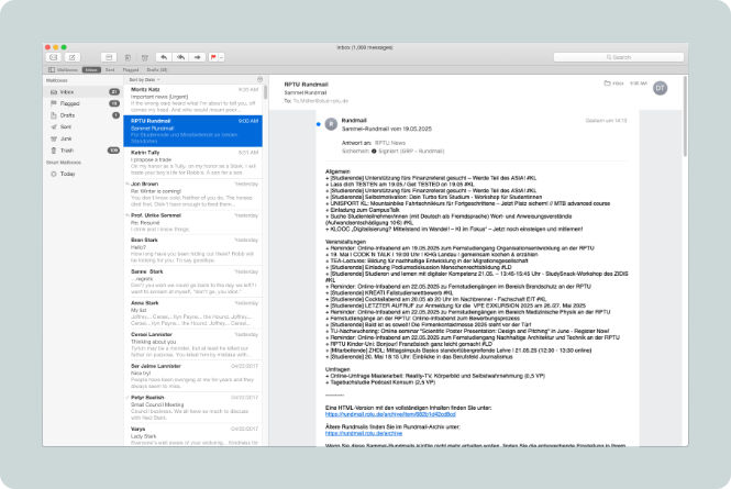
The RPTU newsletter before the redesign: a purely text-based email with long, unformatted text.
Visual hierarchy and the Gestalt principle of proximity play a crucial role , especially in newsletters. The faster recipients can perceive and understand whether and which content is relevant to them, the more likely they are to engage with it. This is particularly important for information that regularly lands in inboxes – otherwise, the reflex to delete the email may dominate over actually reflecting on its content.
When designing the RPTU HTML newsletters, we therefore focused heavily on typography, colour combinations, spacing, and whitespace, as these elements create structure and orientation. Of course, the design also needed to align with the existing corporate design while remaining WCAG 2.2-AA compliant.
How We Brought Together 20 Topics, 3 Target Groups, and 3 Event Locations
For the digest newsletter, which thematically covers a wide range of content for diverse target groups, we created a solution with clear headline structures, icons, and colour coding.
The previous 20 topics for three recipient groups (students, staff, all) across three locations (Kaiserslautern, Landau, all, or online) were consolidated into 6 topic clusters (Events – Leisure, Events – Teaching, Events – General, News, Campus Life, Other), each colour-coded.
The colour coding of topic clusters significantly improves orientation and information capture, helping recipients identify relevant information at a glance. Additionally, we selected suitable icons from the RPTU's icon library that serve as ideal visual anchors for subtopics (e.g., Events – Leisure/Sports).
Technical requirements such as file size limitations and the use of web-safe fonts (Arial instead of the corporate font specified in the corporate design) also required pragmatic solutions.
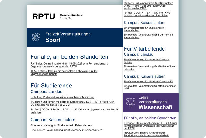
The RPTU newsletter after the redesign: WCAG 2.2-AA compliant, structured HTML newsletters with colour-coded topic clusters, icons for subtopics (Events – Leisure/Sports and Events – Teaching/Science), and clear visual hierarchies.
Communication Optimisation Through Thoughtful Structure and Aesthetics
This project demonstrates how thoughtful design improves communication: visual hierarchies created through strategically used font sizes and spacing guide attention, clear structures simplify navigation, and accessibility ensures that all recipients can actually use the information.
With the new mailing templates, RPTU now reaches over 20,000 students and staff across its two locations in Kaiserslautern and Landau – with newsletters that not only look better but, according to corporate communications, primarily function better.
"So far, we’ve received nothing but positive feedback. With its structure and new design, the new newsletter offers real added value."
Iris Fares, University Communications